So you want to color your home and have all the right ideas inside of your head but don’t really know how it will look blown up on the walls? Or are you simply tired of mixing and matching colors and can’t find the right fit?
Interior designers frequently use the color wheel trick to determine the how to color a house.
Choosing the color schemes for your beautiful home is not an easy puzzle.
Here are some great tricks and tips on coloring your home using the color wheel. Carry a color card from the supplier of paint that you have chosen before embarking on this exciting job.
1. The must-know rule for using colors:
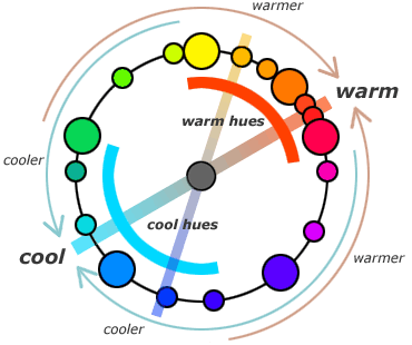
A color wheel, like one shown here, has all the colors laid down in a scientific way. The colors on a color wheel are either analogous or complementary to each other.
Harmonious look:
Simply put, to create a harmonious scheme, choose colors sitting next to each other on a color wheel.
Eg. Yellow and Orange are analogous and so are Blue and Green.
Complementary Look:
To create a complementary scheme, use colors on the opposite side of each other on a color wheel.
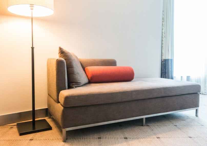
Eg. Purple and Yellow are complementary and so are Red and Green.
Once you have studied the color wheel in this new light, do bear in mind the following points:
- There are cool colors, warm colors, dark colors and light colors. Warm colors create warmer hues, cool colors cooler hues and so on. Higher value colors have more intensity and hence are warm. Lower value colors have less intensity and hence are cooler.
- You can also create different shades for your house by adding white or black to a particular color. For example, if you are inspired by the color Blue, adding a white to it will create what is called a tint. Adding black will create what is called a shade.
Cheats guide to choosing the color scheme of your house:
- Taking inspiration: To start right from scratch, select a color that inspires you. Look around you.
What are you surrounded by? Fresh garden, colorful market or beautiful high-rises?
Take a cue from the surroundings. If Blue inspires you, try creating shades and tints to get a harmonious look. Or take the color opposite Blue, which is Orange-Yellow to get a dramatic look. You can either use the same theme throughout the house or use different themes for different rooms.
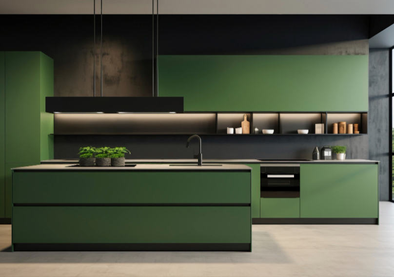
- Colors speak to you: Each color says something. Red, Rich Plums, Purple signifies deeper emotions like love. Blue, Green, Yellow signifies a oneness with the nature. A purple and yellow combination speaks of a powerful personality with a cheerful and quirky side (opposite colors on the color wheel). Rich Reds, Gold, Green, Ivory, and beige signify royalty.
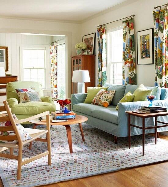
- Largest room: You could start off by deciding the color scheme for the largest room in the house. Typically it is the living room. What mood do you want to set in the room? Are you inspired by any particular theme like maybe a sunrise or a beach? Then you can use colors sitting next to each other on the color wheel like Orange, Yellow, Tangerine, Citrus for sunrise and so on. Colors that look good in nature will go beautifully well in the house.
- Double storied house: Double story houses can sport two completely different schemes if they are clearly separated from each other. You can go warm on the ground floor and totally cool and modern on the next storey.
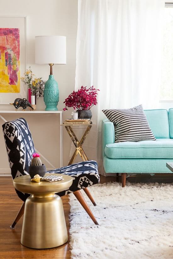
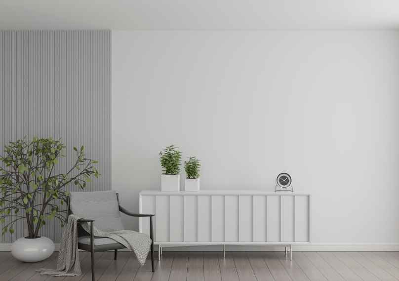
- Accent walls and molds: Create a dramatic impact by playing with different colors on your accent walls or specific moulds on the ceiling or entryways of your house. If working with neutral tones, try to make accent walls a shade lighter or darker than the rest of the walls.
- Don’t forget the ceiling: The fifth wall in your room, the ceiling. Giving the ceiling a different color creates a very interesting room. If you have a trip of POP running along the ceiling, consider painting it a shade lighter or darker.
- The color of the ceiling itself can be complementary to the walls. Although, if you do choose a dark shade for the ceiling, it could make the room look dark. on the other hand if you have lots of natural light in the room, a dark ceiling will pop up beautifully.
- Connecting spaces: Consider keeping the passageways, stairways and other such connectors in a neutral shade unless you want to highlight a particular connecting piece with something light in color.
General tips to avoid a bad paint job:
Before taking you a ride on tips to avoid bad paint job, we would like to tell you the good rule of thumb
MORE COLOR = MORE CONTRAST = THE MORE MESSY AND BUSIER IT LOOKS
The easy approach to solve this color war is to start off with neutral tones.
- Test Painting: It is extremely important to test whether the color scheme selected by you will indeed look good on the walls. Test a sample on a painting foam board using all the combinations you have shortlisted.
- Different light: All colors reflect light differently. Make sure you test your painting foam board under various lighting. Take the foam board out and observe in direct sunlight, daylight, dusk and night. This should tell you if the colors look good and complement each other at all times.
- Consider the fixed elements: Furniture, curtains, window and door frames, floor work, any stone work, etc and make sure the color schemes complement these fixed items in your home.
- Neutral Shades: When using neutral shades, try adding textures or patterns to make the room come alive. Use it only on accent walls so that particular wall stands out.
Find your connection to different colors using this guide. Your beach vacation of trekking holiday could be your inspiration for choosing colors. Let your imagination flow. Because when you naturally feel the flow of each room, the whole color scheme of the house will come alive.
Take inspiration but don’t forget to experiment and have fun. After all it is your own space and you should please yourself first before trying to find ways to please people who visit your house.